

How to Create Client Reporting Dashboards Expert Guide
- Eldon Riley

- Jul 30, 2025
- 10 min read
Imagine having all your client data at your fingertips, presented in a way that's both visually appealing and easy to understand. Creating client reporting dashboards can transform how you manage and present crucial information.
Instead of sifting through endless spreadsheets and documents, a well-designed dashboard offers a clear overview, helping you make informed decisions swiftly. As you read on, you'll discover the secrets to building dashboards that not only impress your clients but also simplify your workflow.
Get ready to unlock the power of data visualization, streamline your reporting process, and enhance your client relationships. Dive in to learn how you can create dashboards that truly make a difference.
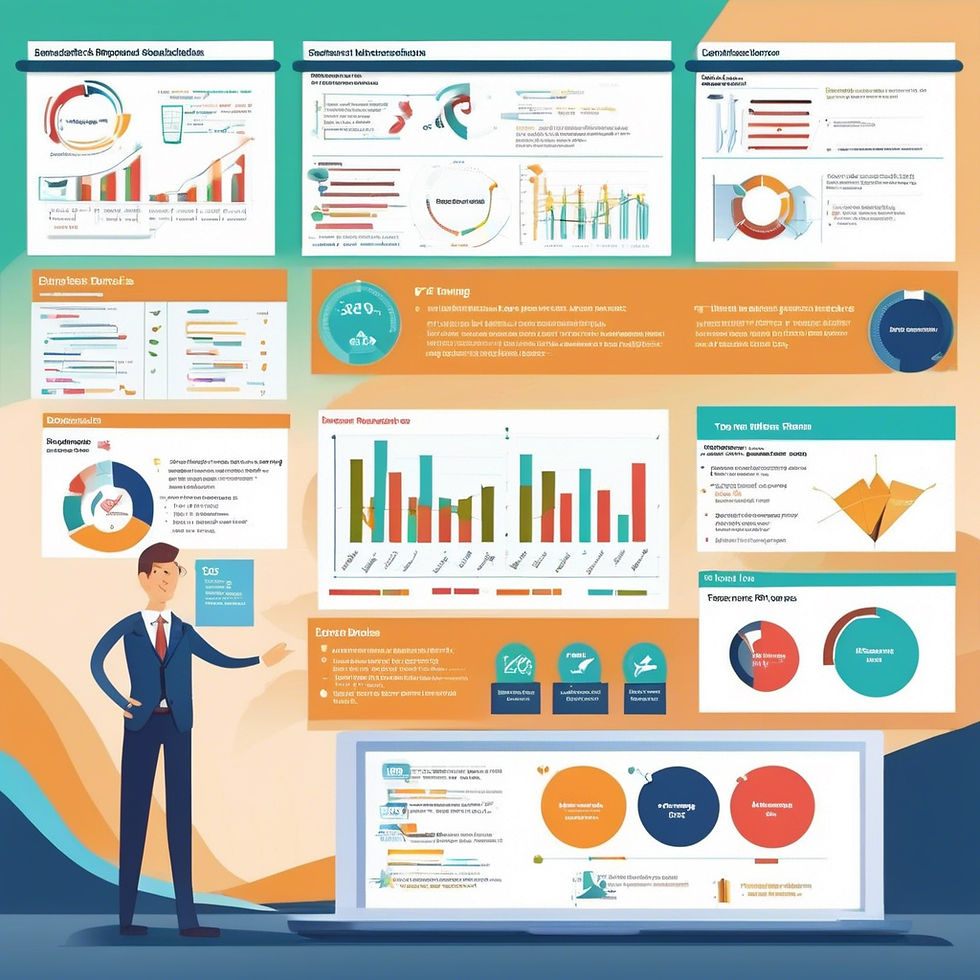
Benefits Of Client Reporting Dashboards
Client reporting dashboards offer many benefits to businesses. They simplify data presentation, making information easy to understand. They improve communication with clients, enhancing transparency and trust. These dashboards also save time by automating the reporting process. Below are some detailed benefits of using client reporting dashboards.
1. Improved Data Visualization
Dashboards turn complex data into simple visuals. Graphs and charts present information clearly. This helps clients grasp insights quickly. Visuals make data engaging and memorable. They reduce confusion and improve comprehension.
2. Enhanced Decision-Making
Dashboards provide real-time data access. This enables quick and informed decisions. Clients can see trends and patterns easily. Timely insights boost strategic planning. Decision-making becomes efficient and effective.
3. Time Efficiency
Creating reports manually takes time. Dashboards automate this process. Automation reduces errors and saves effort. Clients receive accurate reports faster. This frees up time for other tasks and priorities.
4. Increased Transparency
Dashboards promote open communication. They show data directly to clients. Transparency builds trust and confidence. Clients feel more involved and informed. It strengthens business relationships and loyalty.
5. Customization Options
Dashboards offer customizable features. Businesses tailor reports to client needs. Customization improves relevance and satisfaction. Clients get specific data that matters to them. This personalization enhances service quality.
Key Features To Include
Creating client reporting dashboards involves understanding what features make them effective. Key features help communicate data clearly and efficiently. This ensures clients receive valuable insights about their business performance.
Data Visualization
Data visualization transforms complex numbers into easy-to-read graphics. Charts and graphs provide a quick overview of trends. Use color-coded visuals to highlight important metrics. This enhances comprehension at a glance.
Interactive Elements
Interactive elements engage clients by allowing them to explore data. Filters and dropdown menus let users customize their view. This personalization makes data exploration intuitive and user-friendly.
Real-time Updates
Real-time updates ensure clients see the latest data. This feature keeps information relevant and fresh. Automatic data refresh boosts trust in the dashboard's accuracy.
Mobile Accessibility
Mobile accessibility ensures clients can view dashboards on any device. Responsive design adapts the display to fit various screens. This flexibility allows clients to access data anywhere, anytime.
Customizable Layout
Customizable layouts let clients arrange data to suit their needs. Drag-and-drop features facilitate easy customization. Tailoring the dashboard enhances its usability and relevance.
Security Features
Security features protect sensitive client data. Encryption and secure login processes safeguard information. Robust security builds confidence in the dashboard's reliability.
Summary Reports
Summary reports provide a concise overview of key metrics. Brief reports distill complex data into digestible insights. This helps clients focus on what truly matters.

Choosing The Right Tools
Choosing the right tools for client reporting dashboards is crucial. The right tool simplifies data visualization and enhances client communication. Businesses often struggle with finding a tool that fits their needs. There are many options, each with unique features. This section will guide you through selecting the best tool for your dashboard needs.
Comparison Of Popular Tools
Some popular tools include Tableau, Power BI, and Google Data Studio. Tableau offers advanced data visualization with a user-friendly interface. Power BI integrates seamlessly with Microsoft products and provides strong analytics.
Google Data Studio is free and integrates well with other Google services. Each tool has strengths and potential limitations. Understanding these helps in making an informed decision.
Factors To Consider
Consider your budget when selecting a tool. Some tools are free, while others require a subscription. Think about the complexity of your data. Some tools handle complex data better than others. Consider the ease of use for your team.
A steep learning curve might slow down implementation. Evaluate the level of customer support available. Reliable support can be crucial during setup. Also, check the tool's compatibility with existing systems. Seamless integration saves time and reduces errors.
Data Collection And Integration
Creating effective client reporting dashboards requires efficient data collection and integration. Gathering the right data is crucial for insightful analysis. This process involves identifying relevant data sources and ensuring data accuracy. With the right steps, your dashboard becomes a powerful tool for client communication.
Identifying Relevant Data Sources
The first step is identifying key data sources. Start by listing all potential sources. Consider databases, CRM systems, and third-party applications. Look for sources that provide valuable insights. Always align data sources with client needs. This ensures the dashboard serves its purpose effectively.
Ensuring Data Accuracy
Data accuracy is vital for trust and credibility. Verify the data from each source regularly. Use automated tools to check for errors. Cross-check data with multiple sources to confirm reliability. Ensure data is updated frequently to maintain accuracy. This builds client confidence in the dashboard's insights.

Designing User-friendly Interfaces
Creating client reporting dashboards involves designing intuitive interfaces that enhance user experience. Focus on clear visuals and easy navigation. Organize data logically for quick understanding and decision-making.
Designing user-friendly interfaces is essential for creating client reporting dashboards that are not only effective but also enjoyable to use. A well-designed interface can significantly enhance user experience, making it easy for clients to access and interpret data. Crafting these interfaces requires a thoughtful approach, focusing on simplicity, functionality, and customization.
Principles Of Effective Design
To design a user-friendly interface, clarity is key. Ensure that your dashboard layout is clean and intuitive. Avoid clutter by using ample white space and organizing content logically. Consistency helps users navigate the dashboard with ease. Maintain uniformity in design elements like fonts, colors, and button styles.
This creates a seamless experience that feels professional and polished. Consider accessibility. Make sure your dashboard is usable for all clients, including those with disabilities. This might mean adding text alternatives for images or ensuring high contrast between text and background colors.
Customizing For Client Needs
Customization is crucial. Each client may have different needs and preferences. Tailor your dashboards to highlight the data most relevant to them. This ensures they get the insights they need without unnecessary distractions. Engage with your clients.
Ask them what features they find most useful and which ones they feel are missing. This feedback can guide you in refining the dashboard design. Flexibility is a valuable asset. Allow clients to adjust their dashboard settings. This might include changing the view, modifying data filters, or selecting how data is displayed. Empowering clients in this way enhances their satisfaction and ownership of the tool.
Creating user-friendly interfaces for client reporting dashboards doesn't have to be a daunting task. By focusing on effective design principles and customizing to meet specific client needs, you can build dashboards that are not only functional but also delightful to use. How can you incorporate these strategies into your next dashboard project?
Ensuring Data Security
Data security is crucial when creating client reporting dashboards. Protecting sensitive information builds trust with clients. A secure dashboard safeguards data from unauthorized access. Implement strong security practices to keep client data safe.
Implementing Access Controls
Access controls limit who can view or modify data. Assign permissions based on user roles. This ensures only authorized personnel access sensitive information. Regularly review and update access permissions. Remove access for users who no longer need it.
Data Encryption Techniques
Encryption protects data both in transit and at rest. Use encryption algorithms to secure sensitive information. Encrypt data before storing it on servers. This prevents unauthorized users from reading data. Use secure protocols for data transmission.

Maintaining And Updating Dashboards
Crafting effective client reporting dashboards involves organizing data clearly. Use intuitive visuals for easy understanding. Regular updates ensure accuracy and relevance.
Maintaining and updating dashboards ensures they remain relevant and useful. A well-maintained dashboard helps clients make informed decisions. Regular updates keep data fresh and accurate. Incorporating client feedback enhances user experience. Let's explore how to maintain and update dashboards effectively.
Regular Data Updates
Regular data updates are crucial for dashboard accuracy. This means frequently checking and refreshing data sources. Outdated data can lead to incorrect decisions. Automate updates to save time and reduce errors. Use reliable data feeds to ensure consistency. Always verify data after updates. This ensures clients receive the most current information.
Incorporating Client Feedback
Client feedback is vital for dashboard improvement. Encourage clients to share their thoughts. Listen to their needs and suggestions. This helps tailor the dashboard to their preferences. Feedback can reveal issues you missed. Use it to refine and enhance the dashboard. Regularly review feedback and make necessary adjustments. This builds trust and improves client satisfaction.
Best Practices For Effective Reporting
Crafting client reporting dashboards involves selecting clear metrics and organizing data visually. Ensure intuitive navigation and real-time updates for effective communication. Enhance client understanding with concise summaries and actionable insights. Creating effective client reporting dashboards is more than just compiling data; it's about presenting it in a way that is understandable and actionable.
As someone who's had to explain complex data to stakeholders who just want the bottom line, I've learned that clarity is key. Your clients should not only see the numbers but also understand what they mean for their business. Let's explore some best practices that ensure your dashboards aren't just informative but truly effective.
Clear Communication Of Insights
Your dashboard should be a lighthouse, guiding your client through the data. Start by identifying the primary insights your client needs and highlight them. Use straightforward language and avoid jargon that might confuse. Visuals play a critical role in communication.
Choose charts and graphs that fit the data and are easy to interpret. A pie chart might work well for market share, while a line graph is perfect for trends over time. Ensure every visual has a clear, concise title and labels. This simple step prevents misinterpretation and makes your dashboard user-friendly.
Avoiding Common Pitfalls
One common mistake is overloading the dashboard with too much information. More data isn't always better—focus on quality over quantity. Remember, a cluttered dashboard can lead to analysis paralysis. Another pitfall is neglecting the audience's perspective. Tailor your dashboard to suit the client's knowledge level and their specific business needs. What makes perfect sense to you might be confusing to them. Lastly, don't forget to test your dashboard.
Gather feedback from your client or a colleague to catch any issues you might have missed. A fresh pair of eyes can be invaluable in ensuring the clarity and effectiveness of your reporting. By focusing on clear communication and avoiding common pitfalls, you create dashboards that not only report data but also drive informed decisions. What steps will you take to transform your reporting?
Case Studies Of Successful Dashboards
Creating client reporting dashboards involves understanding key metrics and design principles. Successful case studies highlight clarity, functionality, and user-friendly interfaces. These dashboards simplify complex data, enhancing decision-making and client communication.
Creating client reporting dashboards can be a game-changer for your business. But what makes a dashboard truly effective? Let's dive into some case studies of successful dashboards and uncover what worked and why. By examining these examples, you’ll gain practical insights to craft your own powerful reporting tools.
Case Study: E-commerce Retailer’s Sales Dashboard
An e-commerce retailer needed to track daily sales and marketing performance. They created a dashboard that displayed real-time sales metrics, inventory levels, and marketing campaign results. The key to their success was simplicity. They focused on clear visuals and avoided clutter. This allowed their team to quickly identify top-selling products and optimize inventory levels.
Case Study: Digital Marketing Agency’s Client Performance Dashboard
A digital marketing agency wanted to demonstrate the ROI of their services to clients. They built a dashboard highlighting key performance indicators like website traffic, conversion rates, and ad spend. They personalized the dashboard for each client, showing data relevant to their specific goals. This tailored approach impressed clients and strengthened their trust in the agency.
Case Study: Healthcare Provider’s Patient Care Dashboard
In the healthcare sector, a provider needed to monitor patient care metrics. They designed a dashboard that tracked patient satisfaction, appointment wait times, and treatment outcomes. What set this dashboard apart was its focus on actionable data. Healthcare professionals could immediately see areas needing improvement, leading to enhanced patient care and satisfaction.
Case Study: Financial Services Firm’s Risk Management Dashboard
A financial services firm required a dashboard to manage risk effectively. They included metrics like credit risk, market trends, and compliance status. The firm succeeded by integrating data from multiple sources into one coherent view. This comprehensive approach enabled them to make informed decisions quickly, mitigating potential risks.
Lessons Learned From These Case Studies
- Keep It Simple: Clarity is crucial. Avoid overwhelming users with too much information. - Tailor to the Audience: Understand what your audience values and customize the dashboard accordingly. - Focus on Actionable Data: Present data that leads to clear actions and decisions. - Integrate Seamlessly: Ensure data from various sources is harmonized in a single view for comprehensive insights. What can you learn from these examples to apply to your own dashboards? Think about the specific needs of your business and clients. Consider how you can simplify, tailor, and focus your data to drive better decisions. The right dashboard can be your best ally in achieving success.
Frequently Asked Questions
What Are Client Reporting Dashboards?
Client reporting dashboards are visual tools that present key performance indicators, metrics, and data insights. They help businesses track and analyze client-related information efficiently, enabling informed decision-making. Dashboards simplify complex data, making it accessible and understandable for clients, thereby enhancing transparency and communication.
Why Use Dashboards For Client Reporting?
Dashboards streamline data presentation, providing real-time insights and fostering better client communication. They offer a centralized view of performance metrics, improving transparency. By using dashboards, businesses can efficiently track progress, identify trends, and make data-driven decisions that enhance client satisfaction and retention.
How To Choose The Right Dashboard Tool?
To choose the right dashboard tool, consider your specific reporting needs and budget. Look for features like customization options, integration capabilities, and ease of use. Evaluate the tool's ability to handle large data sets and its compatibility with existing systems to ensure seamless implementation.
What Are Key Features Of Effective Dashboards?
Effective dashboards offer real-time data visualization, customization options, and integration capabilities. They should be user-friendly and provide actionable insights, enabling quick decision-making. Look for dashboards with interactive elements, scalability, and compatibility with various data sources to maximize their utility in client reporting.
Conclusion
Creating client reporting dashboards can simplify data insights. They keep information organized. Clients appreciate clear, visual data presentations. Dashboards save time and reduce errors. Choose tools that match your needs. Customize to highlight key metrics. Regular updates ensure relevance and accuracy.
Simple designs enhance understanding. User-friendly interfaces improve client satisfaction. Consistent feedback helps refine dashboards. This improves their usefulness over time. Embrace this tool for better communication. Clients will value the clarity it provides. Start building dashboards today for better client relationships. Stay focused on delivering clear, actionable insights. Your efforts will lead to success.
Let’s Build Your Success Together
Don’t wait for results to happen—create them. With URDigital Tech, you’re not just getting a service; you’re gaining a partner invested in your success.
Email us at: solutions@urdigitaltech.com
Text us at: (716) 400-0769
Contact us today to see how we can help you turn ideas into impact and opportunities into achievements.


Comments